If fighting possessed Outlaws was hard, how on earth can Batman and Wonder Woman hope to take on Superman possessed by Deadman possessed by…Circe? A pit? Whatever it is, it’s mean, and things only get meaner in Trinity #14. SPOILERS AHEAD
I don’t love it…
This arc has been challenging for me from concept. I’m not a huge fan of everything working together tidily, and all of these trinities have been driving me crazy. Ra’s attacks Circe for it this time, but it’s less about her murdering the word “trinity,” and more about her failure to attain her goals. She’s more loser than nerd.
Beyond that, the dialogue has been off at times. Whether it’s been uncharacteristic phrasing from the big three, or the seven-esses -for-every-vowel speech of the possessed, it’s been hard to read (the seas of red on black text haven’t helped). Thankfully, Batman sounds more like Batman this time, but with Superman inhabited by Deadman inhabited by something for most of the issue, we have one less main character speaking to us through good, reliable, comfortable black-on-white. And it’s hard.
…but I don’t hate it, either
Despite the return of these nagging qualms, though, I actually enjoyed this one a bit more than earlier installments. It’s nice to get some backstory on Circe and understand what’s in this for her. I wouldn’t say her vulnerability quite humanizes her, because we aren’t given enough time for it to pull off such a feat; however, she does become more believable as a character, because I no longer see her twirling an invisible moustache. She desperately wants something that she lost, and—tragically—her methods have rendered her unworthy of it.
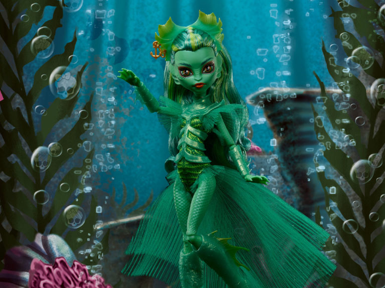
I also really, really enjoy what Marion, Florea, and Rebeiro bring to this. The layouts are packed full of energy without getting too busy, and there are some gorgeous backgrounds and some truly stellar shots of Batman and Circe. Marion’s Bats is perhaps more lithe than what other artists do lately—not quite Neal Adams proportions, but still a more believable acrobat. Circe looks both villainous and lovely in the same glance, so mission accomplished there. Florea—who frequently inks this issue’s cover artist, Tony Daniel—does a great job, too, with thin lines that complement Marion’s thinner character aesthetics well. And Robeiro does particularly nice work on Marion’s backgrounds, whether it’s buildings lining a city street, or more exotic, abstract set pieces like this one here:

Wands is given a lot of text to work with, and oftentimes few good options for placement amidst Marion’s artwork, but he handles it well. There are a number of instances where the scene feels crowded by balloons (several of which are especially wide ones), but I can’t see where Wands had any choice. Lots of text and pages shattered into oddly-shaped panels make his job a lot harder.
My one suggestion for Wands/editorial—and they can tell me where to put it if they’d like—is to drop the Action Comics font in the scene meta text. It was a nice touch in Trinity’s first arc, which began with some big Superman moments and took place (sort of) at the Kent farm, but I feel like it’s overstayed its welcome. Trinity is about the three of them, and this font does and always will feel distinctly Superman.
Recommended if…
- You like a more wiry, less chunky Batman—Marion’s is excellent.
- You like all of this multi-trinity stuff, or you don’t but are willing to give it a shot with some more character depth

Overall
I’ll never love the concept, but Williams is winning me over by cleaning up some of his mistakes and making his villain quite a bit more compelling. Marion, Florea, and Robeiro turn in a very exciting visual, deftly navigated by Steve Wands, and all of a sudden, Trinity is an enjoyable read once again. Here’s hoping this is the start of a trend!
SCORE: 7/10